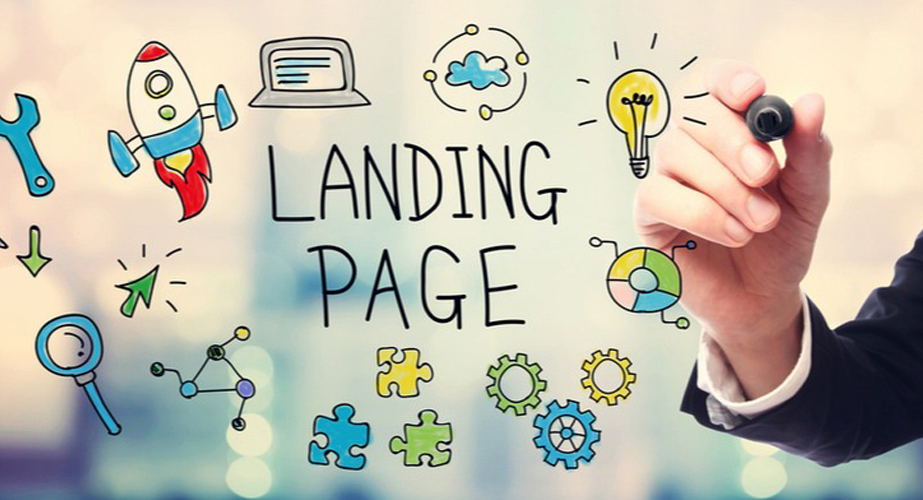
Your landing page is kind of like your ‘hello’ to the world. It’s what your clients, customers, and potential customers will see first.
When you’ve invested in Google ad campaigns and have successfully drawn people onto your website, you don’t want to lose them straight away because of a poor landing page.
It is good to know that your landing page is just as important, if not more, than every other page on your website. If you’re not seeing the conversions you want or your bounce rate is too high, it’s possible that you’re making one of these common landing page mistakes.
1. Poor Lead Generation
Lead generation is the act of captivating your audience and encouraging them to initiate contact or purchases.
Often, what causes lead generation is the incorporation of bold headers, interesting snippets of information, and calls to action, among other things, that sparks interest in your website visitors.
A common mistake is when too much information or popups are active all at once, which can be quite overwhelming for the visitor. Additionally, too many elements can also cause your website to slow down, resulting in a frustrated customer.
Spending time on your lead generation marketing will be worth it when you start seeing your leads convert into customers. But if the components on your landing page do not work well together, it can be difficult to achieve this.
2. Not Optimised For Mobile Phones
With pretty much everyone browsing the internet on mobile phones, it is absolutely essential to have your own optimised for mobile use.
Neglecting this can be an easy trap to fall into but can be devastating for your conversion rates.
Making your landing page mobile-friendly should be a priority. If a potential customer finds your website somewhere and decides to visit it but is welcomed with a strangely disproportionate landing page, they’re most likely to leave.
It’s also become common for Google to rank websites that are optimised for mobile higher than those that are not. This became the norm in 2016 when Google announced that mobile-first indexing (MFI) will be its primary approach when it comes to ranking your website.
In other words, before 2016, Google relied on ranking websites based on desktop-first indexing, but as mobile phones have grown in popularity, the way in which Google ranks its websites has also changed.
The crucial nature of optimising your website for mobile is made clear by Google who explained that if you have a desktop and mobile version of your website, they will only crawl from the mobile version. So, basically, if your important data is not available on mobile, your Google rankings are going to drop drastically.
Within two years, the percentage of pages using mobile-first indexing has increased by 20%. 70% of pages appearing in Google’s search is because of mobile-indexing. When seeing these figures, it is clear that mobile-optimisation is worth implementing.
3. A Cluttered Interface
Your identity, message, and offerings should be visible and clear on your landing page. Having a professional logo and quality images will not mean much if visitors cannot understand what you have to offer.
There is a link between clutter (not only on screens but in real life too) and the limitation it puts on our ability to focus and organise information.
Instead of trying to include everything on a page, put yourself in the mind of the visitor. Search engines base their rankings on the behaviour of people.
If user engagement is poor on your website, the search engine will take this as a sign that your website is either not relevant or suited to that keyword. As a result, your ranking will be lower.
4. Inconsistent, Arbitrary Images
Using stock photos is an incredible way to generate content on a continuous basis. When it comes to your landing page though, your window to the world, it will be more beneficial to use your own, professional images.
Customers can spot generic content. Instead of opening up the possibility of losing your credibility and authority with them before they’ve read anything, make your professional reputation known.
There is a sense of expertise when images on a website are authentically and professionally taken, and display the product or service in a way that visitors could see themselves using.
Stock photos can be great for other pages or even blog posts, but for the page that introduces your business to the world, it is wiser to use images that are unique to your brand.
5. Ambiguous Calls to Action
Ultimately, you want your landing page to convince the visitor to take the next step in becoming a paying customer. This is likely to happen with the help of a call to action (CTA) button.
A vague CTA button can be detrimental to potential conversions if it causes the customer to feel confused or lost. Besides that, they can also feel uncertain as to what they will actually get from clicking on it.
On the same note, if you have too many CTA buttons on your landing page, this can also pose a problem. It can become very perplexing and even misleading.
As much as customers may need a push to move to the next step, it is also wise to leave them feeling like they’re making the decision for themself. Avoid appearing too aggressive.
Be mindful of maintaining clear instructions as this will help preserve user satisfaction.